…view older images with the thumbnails below…
“Gritty Peaks”
…view older images with the thumbnails below…
a daily photo from joshua l. smith
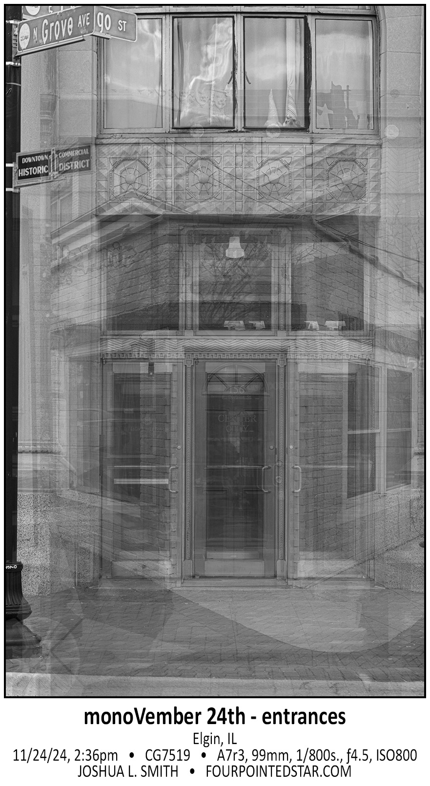
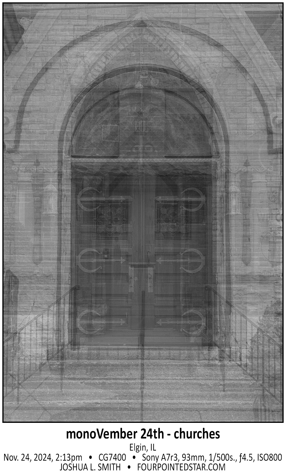
Elgin has so many wonderful buildings. This one on Douglas Avenue is very interesting, the fancier façade partially extends to the side which implies that this wasn’t going to be as visible, but there are windows which implies that there wasn’t going to be a building immediately next to it… (Ok, so maybe not “very interesting” only “interesting”.)
…view older images with the thumbnails below…
I tend to edit my photos based on how they “feel” and one of those feelings is balance.” The photo should appear balanced, but the sad part is that I don’t know that I could quantify what makes a photo balanced … but I know it when I capture the photograph or in most cases, when I edit the photograph.
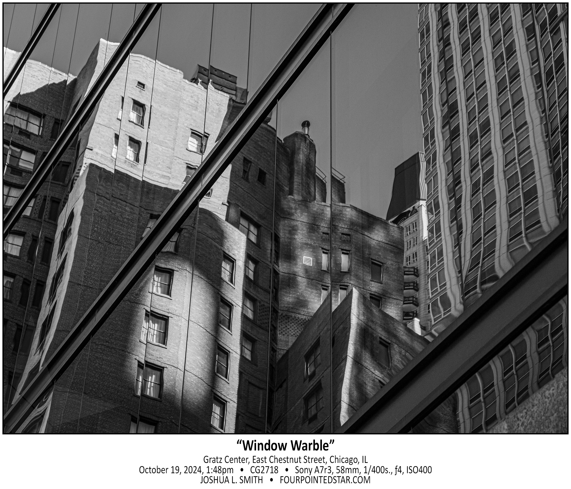
Sarah and I took a day trip up to visit family in Milwaukee and on the way took a walk through Milwaukee. I may enjoy reflections in windows more than any other kinds of architecture photography.
…view older images with the thumbnails below…
As Sarah and I walked past 833 Michigan Street, we both noticed the modern abstract fixture hanging in the lobby. The installation definitely feels at home inside of the the large glass lobby, but the reflection of the US Bank building in the same windows blocked the view of the fixture. Fortunately, the contrast between the two makes a compelling photograph.
…view older images with the thumbnails below…
cz
If you start looking, the reflections of any town will provide dynamic views and photographs. I love the unfinished nature of this photo; how the angle of the foreground building gives the appearance of an unfinished canvas that drops into the negative space provided by the soft blue sky. You will find many reflections throughout my architecture photography, and I know that there will be more to come as well!
…view older images with the thumbnails below…
There were several of these kinds of infinite depth items; the previous yellow photo is another example. However, this installation was different, there were more than a dozen of these cubes stacked on each other, and the blue lights’ activity was somewhat responsive to the people passing by. It definitely reminded me of something futuristic, like maybe it represented the vastness of space.
…view older images with the thumbnails below…
We took the girls to the WNDR Museum – which if you’re not sure what that is, you should think “Instagram/Snapchat scenes”. It was honestly really cool; and several of the art installations were very well done. Each of the girls found a couple of rooms that they really enjoyed interacting with.
…view older images with the thumbnails below…
Some of my favorite images over the years have been my more abstract images and the images with a strong use of negative space. The “bird’s wings” floating in the void of the blue sky was absolutely beautiful on the day of our visit, and I also enjoy the simplicity of the monochrome image.
…view older images with the thumbnails below…
Anytime that I visit a location for a second or third time, I want to take photos that are unique to each visit. Which means that with each visit the photos get more challenging but the images get more inventive. The intersection of lines in the pavilion is full of unique images and surprises.
…view older images with the thumbnails below…